
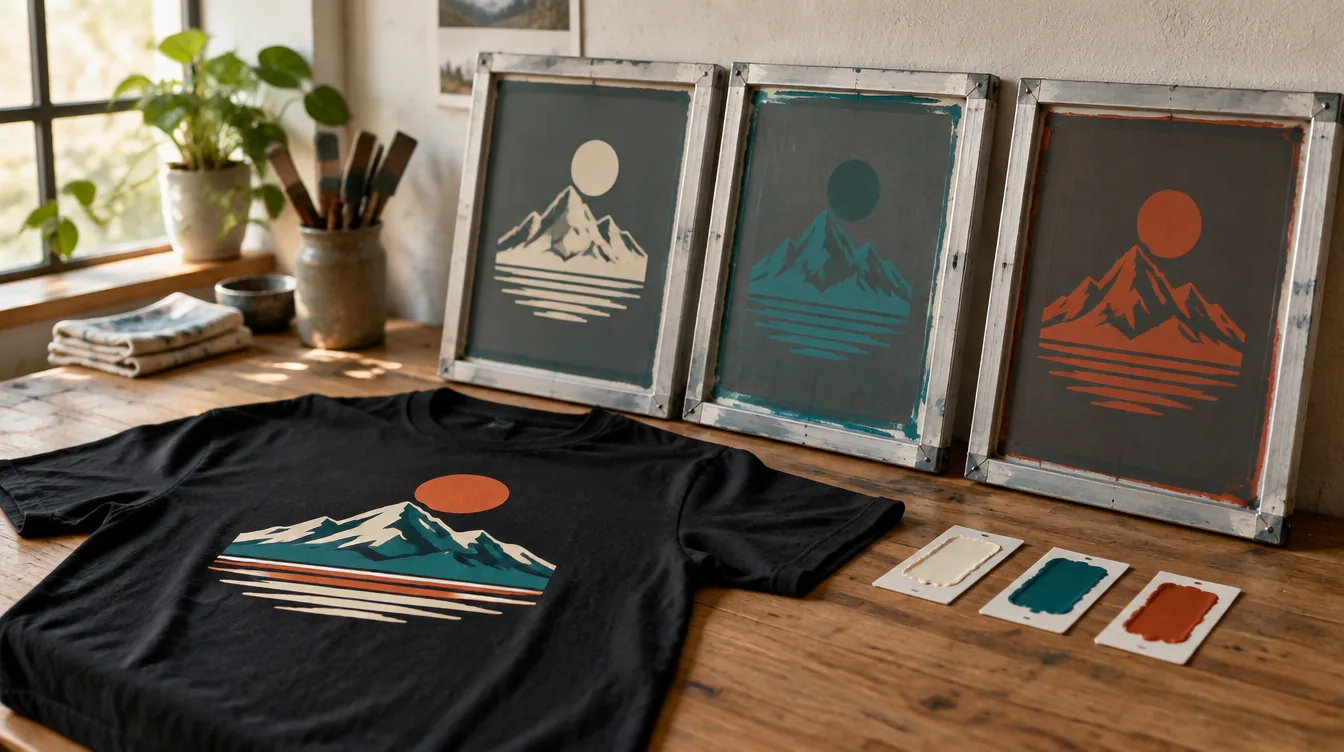
A school mascot, a business logo, or a church event design can look great with one ink color. Other artwork genuinely needs several. The useful question is not simply how many colors you can fit into a design. It is which colors help people recognize the message, and what it takes to print them on the shirt you want.
There is no universal maximum number of screen printing colors. The practical limit depends on the shop’s equipment, the artwork, the garment, and the production approach. DDESIGNS can review your design and recommend a workable method; don’t assume a particular color limit without checking your project.
Start by separating three things: colors you see, inks used to create them, and the shirt color underneath. They are related, but they do not always produce the same count.
Visible Colors Are Not Always the Production Color Count
In conventional spot-color screen printing, each ink color generally gets its own screen. The screen controls where that ink appears in the design. ScreenPrinting.com’s printing guide explains this separation and setup process.
A red-and-white logo on a navy shirt might look like a three-color combination, but navy may simply be the garment showing through. Conversely, a design with two visible ink colors may require a supporting layer underneath them.
That is why counting the colored squares in a design file is only a first estimate. Send the actual artwork and intended shirt color when you ask about production. Your printer can evaluate what needs to be printed and what can remain open fabric.
Our screen printing service is a starting point for projects built around bold artwork and repeated designs. The final production plan comes from reviewing the order itself.
What Is an Underbase, and Does It Count as a Color?
An underbase is a layer printed beneath other inks, often white, that helps those colors show clearly on a darker garment. It supports the visible design even when you do not see it as a separate shape.
For example, imagine a yellow-and-red graphic on a black tee. Printing those colors directly on the shirt and printing them over an appropriate underbase can produce different appearances. The actual approach depends on the inks, fabric, and intended effect. ScreenPrinting.com’s underbase demonstration shows why the background matters.
The practical question for a quote is: “Does the production plan include an underbase, and how is it accounted for?” Do not assume a two-color-looking design always means only two production screens. Also, do not remove a needed underbase just to make the count smaller without understanding the appearance tradeoff.
Visible white lettering and an underlying white layer are different jobs. Whether they can share part of a production approach is something the printer should determine from the artwork.
Give Each Color a Job
A strong design establishes what people should notice first. Before adding another color, identify the main message: a team name, a business name, a mascot, or an event title.
Then assign color deliberately:
-
Use a main color for the most important element.
-
Use a contrasting color when it helps text or shapes remain distinct.
-
Use an accent to draw attention to a genuinely important detail.
-
Remove extra shades that do not improve recognition.
Imagine a volunteer shirt with an organization name, a small icon, and an event date. A single high-contrast ink could communicate all three. Adding a second color to the icon may strengthen the design. Adding separate colors to every word may make the shirt busier without making it easier to read.
That example is a design exercise, not a rule that every project should be one or two colors. A required multicolor logo should not be casually redrawn to reduce the count.
Let the Garment Participate in the Design
The shirt is part of the palette. Open areas in artwork can allow garment color to create contrast or form part of a graphic. This can produce a cohesive look without printing every visible area.
Check the idea across every shirt color you plan to order. An open area that works on black fabric may become hard to distinguish on gray. A design approved on a light shirt does not automatically work on a dark one.
If you want multiple garment colors, ask whether one artwork version works across all of them. Otherwise, an ink change or revised artwork may be needed. Decide which shirt colors matter most before committing to a design built around a specific background.
Also review contrast at the intended print size. Two colors can look clearly different in a large computer preview but become harder to distinguish when reduced to a small chest mark.
Can Shading Create More Colors Without More Inks?
Sometimes. Halftones use patterns of small dots to create the appearance of lighter tones and shading. They are one reason the colors perceived in a finished image do not always correspond directly to separate ink colors. Apparel supplier alphabroder explains halftones and spot-color printing in its screen printing FAQ.
However, halftones are not an automatic shortcut for every design. The original art, detail size, fabric surface, and desired result all matter. A smooth digital gradient needs production review rather than an assumption that it will translate unchanged.
If the artwork is a photograph, a complex illustration, or a logo with many gradients, send the original file. Ask whether screen printing or a different decoration method makes more sense before simplifying away the details that make the image recognizable.
Compare a Full Version and a Simplified Version
When budget matters, request a meaningful comparison. Keep the garment, quantity, print size, and placement consistent, then compare your preferred artwork with an approved reduced-color version.
That helps you see whether the extra colors earn their place. You may decide the full design is worth keeping, or discover that a simpler version communicates more clearly.
Color is only one part of the overall quote. For a broader explanation of quantities, garments, and print locations, read our guide to screen printing costs. The focus here is choosing the visual information that matters before you price it.
For consistent brand color references, see our guide to PMS color matching. It explains how to communicate a target color without confusing it with the number of inks in the design.
What to Send for a Useful Color Review
You don’t have to calculate screens yourself. Send enough information for the shop to see the complete project:
-
Your best available artwork file.
-
Preferred garment style and color, including alternate colors.
-
Approximate quantity and size range.
-
Each print location you want.
-
Required brand colors or an approved one-color logo.
-
Your deadline and any flexibility in the design.
Note which elements cannot change. A sponsor’s mark, official school logo, or required wording may need separate approval before revisions.
For your next Springfield team, business, or event order, send DDESIGNS your design for a quote. We can help turn “How many colors?” into a more useful conversation about a shirt people can read, recognize, and want to wear.