
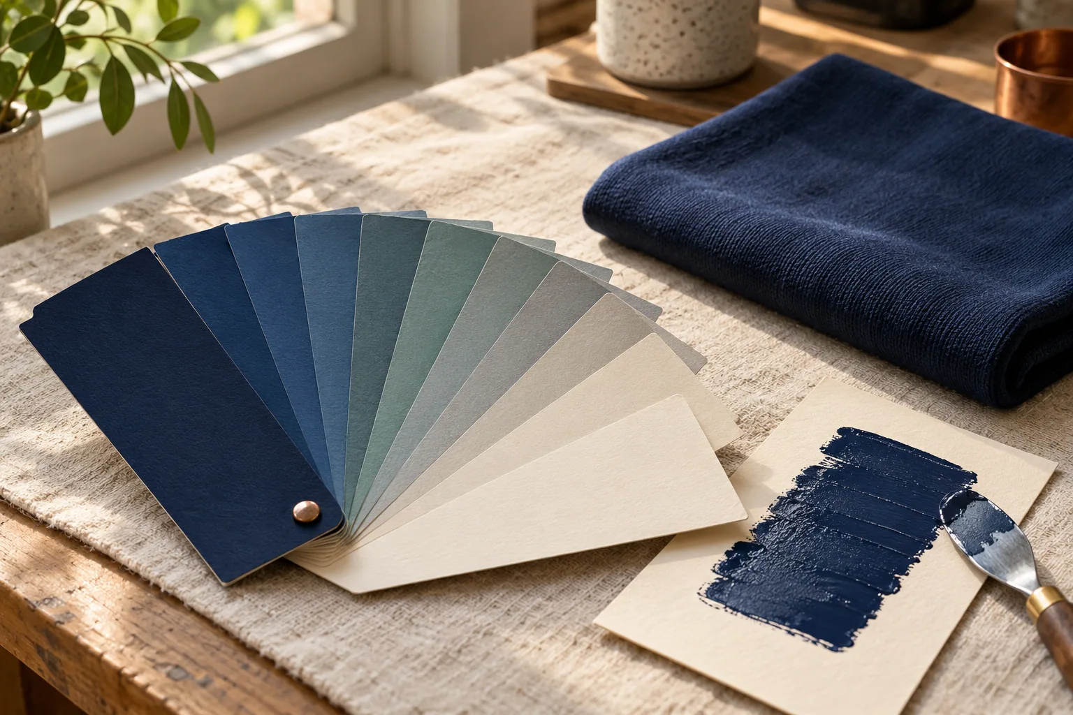
Quick answer: PMS means Pantone Matching System, a shared system for identifying color targets. A complete Pantone reference helps your printer discuss a brand color more precisely than “royal blue” or a phone screenshot. For apparel, it is a reference to interpret across ink, thread, and fabric, not a guarantee that every material will look identical.
Your logo may look blue on a laptop, slightly purple on a phone, and darker on last year’s shirt. A clear color reference helps everyone agree on which target the next order should use. Pantone explains its color systems here.
What does PMS mean in color specifications?
A color name leaves plenty of room for interpretation. Your version of forest green may be different from the green your designer had in mind.
A PMS reference points to a defined color in a particular Pantone library. If your brand guide includes one, send the complete reference with your artwork. Keep any letters that follow the number; they are part of the information.
You do not need to learn ink mixing to order shirts. You just need to avoid turning a precise reference back into a guess. Copying the exact notation from your approved brand guide is more helpful than sending a screenshot of a blue square and asking someone to match it.
If you don’t have a brand guide, say so. You can still start a project with a logo file, a previous garment, or a description of the look you want. The important part is making the missing reference clear before artwork approval.
What do C and U mean?
You may see a Pantone number followed by C or U. Those letters mean coated and uncoated, referring to the paper used for the printed graphics reference. They do not mean cotton and uniform, and they are not instructions for the fabric finish.
Pantone’s coated and uncoated explanation notes that the same color can look different on the two paper surfaces because the paper interacts with the ink differently.
That distinction matters when you move from business cards to apparel. A reference printed on paper is a target for discussion; a shirt is a different surface. Don’t change the suffix yourself because one version looks closer on your monitor. Send the original specification and ask how it will be interpreted for the project.
PMS, RGB, HEX, and CMYK: which reference should you send?
Your designer may have supplied several color values. Keep them together, but label them clearly.
| Reference | What it communicates | How to send it |
|---|---|---|
| PMS | A defined Pantone color target | The full reference from the approved guide, including its suffix |
| RGB | Red, green, and blue values for screen-based color | Labeled digital values with the current logo file |
| HEX | A hexadecimal notation for digital color values | The code, identified as a website or digital reference |
| CMYK | Cyan, magenta, yellow, and black process-printing values | The labeled values from the brand guide and any approved print reference |
A digital value does not automatically identify one exact PMS equivalent. Similarly, a process-color version may not reproduce a spot color precisely. Pantone’s spot-versus-process guide explains the distinction between individually specified spot colors and colors created with combinations of process inks.
If all you have is a HEX code from your website, include it. Just tell the shop that it is your available digital reference rather than calling it your approved PMS color.
Why the same brand color can look different on apparel
Think about the whole item, not only the logo file. A smooth printed mark on a light tee, a stitched mark on a textured polo, and a graphic on a dark hoodie do not present color in the same way.
Garment color, surface texture, decoration method, and lighting all affect the comparison you see. A thread selection for custom embroidery also comes from a different material system than printing ink. Coordinated apparel can look consistent as a group without every item being an indistinguishable match up close.
This is why your printer needs to know when pieces will appear together. Staff polos worn beside event shirts create a different comparison than items used separately throughout the year. Mention whether you are adding shirts to an existing uniform program or starting with a new design.
For printed logos, our screen printing service is one option to discuss. The artwork, garment, order size, and color expectations help determine the appropriate approach.
Decide what needs to match before reviewing a proof
Give your shop a short priority list. For a school, the official school colors may matter more than a decorative accent. For a business, the logo might have strict brand requirements while the shirt color has some flexibility.
Useful notes include:
- Which colors are mandatory and which are flexible.
- Whether an approved one-color logo is available.
- Whether the new order needs to coordinate with existing apparel.
- Whether different garment styles will be worn together.
- Who has authority to approve the artwork and color direction.
An old shirt can provide useful context, but identify it as a previous garment rather than the unquestioned color standard. Wear, washing, and age may have changed its appearance. If your brand guide conflicts with the shirt, make that conflict visible before production decisions are made.
What a digital proof can help you check
A digital proof is useful for reviewing logo placement, spelling, proportions, and the intended combination of garment and artwork colors. Inspect those details carefully, including how small text and secondary marks appear.
Treat the screen as a planning tool rather than a physical color sample. Screen settings and viewing conditions can change your impression of the same image. If a close color match is essential, ask what physical references or approval options are available for your particular order, and whether they affect cost or timing.
Agree on the reference and the review method before assuming a production sample is included. Our guide to ordering screen printed shirts explains the broader artwork and ordering process.
Send a clear color brief with your quote request
A good color brief can be short. For example: “Our approved logo file and brand guide are attached. The main blue is the priority. We are considering gray shirts, and these will be worn with existing navy staff polos. Please flag any color limitations before we approve the artwork.”
That is an illustrative brief, not a required form. Add your quantity, sizes if known, intended garment, and event date. If you have several versions of the logo, label the current one so the wrong file does not become the starting point. Our guide to file types for T-shirt printing helps you choose which artwork files to send.
FAQ: PMS color references
What does PMS stand for in printing? PMS stands for Pantone Matching System. It provides a shared way to specify color targets. Send the complete reference from your approved brand guide, including any suffix, with your artwork.
What is the difference between Pantone C and U? C means coated paper and U means uncoated paper in Pantone graphics references. The paper changes the appearance of the ink. These letters do not identify a garment fabric or instruct the shop to use a particular fabric finish.
Can a HEX code be used to order custom apparel? Yes, include it when it is the reference you have. Label it as a digital value and ask how the shop will interpret it. A conversion should be reviewed rather than treated as an automatically approved PMS match.
Will embroidery thread exactly match a PMS ink color? An exact match across different materials should not be assumed. Thread has its own available colors, texture, and reflective qualities. Ask about the closest suitable physical thread reference and review it with the garment when a close match matters.
Is a digital proof enough to approve an exact color? It is useful for checking spelling, placement, proportions, and intended color combinations. Screen settings and viewing conditions limit its use as a physical color standard. Discuss available physical references or approval options before production if color accuracy is critical.
Bring your color reference and your goal
If you’re sorting out what PMS means in color for a new order, bring the references you already have. Your approved artwork, brand guide, garment preferences, quantity, and needed-by date give us a useful starting point.
Call 417-839-5222 or request a custom apparel quote. DDESIGNS is a family-run shop in Springfield, Missouri, and we’ll help you work through the practical color choices before artwork approval.
Featured image: AI-generated product illustration.